Prepressure covers design techniques, PDF, PostScript, fonts, JDF and numerous other prepress topics that have to do with printed communication and graphic arts.
Must-reads
These are my current favorite sources of information about prepress and print:
- The Printing Industry Blog is written by Steven Waxman and distributed as a weekly e-mail newsletter as well.
- Inkish is a bit of a loose cannon in the printing industry. I think it is much needed now that so many publications and websites stick to alternating between copy-paste’d press releases and editorials written by industry experts who are also working as consultants for the same companies whose products they are supposed to write critical, objective articles about. Morten B. Breitoft, the editor of Inkish, writes interesting ‘stream of conscience’-alike articles that look beyond the world of print. It is a pity, however, that the layout and typeface of the Inkish website deliver such a poor reading experience.
- Each week the PrintPlanet email newsletter includes a teaser for Gordo’s new cartoon. After checking out the cartoon, I often check out the most recent new threads on the forum. It’s a nice way of staying up to date on what is going on in pressrooms and prepress offices.
Too much overlap
I typically do major updates of this site during the Christmas break. This time around I noticed the site has been running on WordPress for 15 years now. For my current daytime job I typically also have a few browsers open to work in WordPress. Because of the overlap, I’ve neglected prepressure.com a bit. My apologies if there isn’t much new content or if it takes some time before comments get reviewed and published.
IPEX in Beirut?
This animated slider about the history of print is worth the five minutes it takes to go through it. Just take it with a grain of salt. No, Benny Landa did not invent digital printing at IPEX in Beirut, Lebanon.
Metric and beyond
The page listing paper sizes is one of the most viewed ones on this site. Now that Google directly tells you how large an A4 page is on its search results page, that will not last. Coming up with something better is going to be difficult, however, since it already exists. Watch the video and prepare to be amazed.
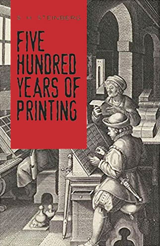
Five hundred years of printing
This is an interesting book, even though it is academic and can be quite dry. It also stops 500 years after Gutenberg started printing and doesn’t cover the evolution after the second world war. I’ve used notes from reading it for a major update of the ‘History of printing‘ section of this site, especially the period from 1450 to 1800.
While doing that I stumbled across the video below about the history of the first printing press, hosted by Stephen Fry.
Growth of online print
Whattheythink.com published this graph showing the evolution of the online print market in Europe. The growth varies by country, with southern Europe trailing the more northern countries.

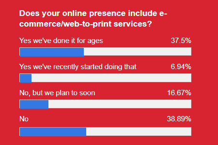
In Late March 2021 PrintWeek put up a poll asking printers about their web-to-print plans. I find it odd that 17% of the respondents are only now looking into this.
Prepress Pete is tweeting
70 years of IKEA catalogs
The IKEA catalog is the most distributed book in the world. In 2013 over 200 million copies were printed. Meanwhile, that copy count may have gone down somewhat, as the company is experimenting in some countries with replacing the annual edition by seasonal mini-catalogs.
You can now browse the Swedish editions of all the catalogs from 1950 till now on the IKEA museum site. Below are the covers from every past decade. The sizes are not proportional, as I wanted to cram all of them in a single image with identical gutters. Note the jump from black and white to color, with the layout and color quality improving dramatically in the ’80s. Erase the date on the 1990 edition and you might convince me it is this year’s ‘retro catalog’.

Prepress Pete is tweeting

More postcards
I’m still fascinated by photochrome prints, so during the holidays I added a set of postcards of castles and palaces.

Older comments can be found here.